

Deciding what deserves prime space on your homepage can feel overwhelming. You want every visitor to immediately understand what sets you apart, yet it is easy to get lost in flashy design and long-winded messages that chase people away before they even learn what you offer.
Your homepage should invite users in, build instant trust, and gently move them toward action. With a thoughtful approach, you can craft a homepage that combines clarity, accessibility, and persuasive cues that guide every visitor closer to becoming a loyal customer.
Ready to discover practical ways to make your homepage more effective? The strategies ahead are designed to help you create a memorable first impression and turn your homepage into your brand's best salesperson.
Table of Contents
- 1. Prioritize A Clear Value Statement First
- 2. Use Easy-to-Read Fonts And Simple Colors
- 3. Make Navigation Predictable And Visible
- 4. Highlight One Clear Call-To-Action
- 5. Add Trust Signals Like Reviews Or Badges
- 6. Use Quality Images That Fit Your Brand
- 7. Check Loading Speeds And Mobile Friendliness
Quick Summary
| Takeaway | Explanation |
|---|---|
| 1. Craft a Compelling Value Statement | Clearly communicate your unique business value within seconds to engage visitors and boost conversion rates. |
| 2. Ensure Readable Fonts and Colors | Use accessible typography and a simple color palette to enhance readability and user experience on your homepage. |
| 3. Optimize Navigation for Clarity | Design clear, predictable navigation to help users easily find information, reducing frustration and bounce rates. |
| 4. Use a Single, Clear Call-to-Action | Focus on one strong CTA that stands out and drives visitors toward a specific goal, increasing engagement and conversions. |
| 5. Integrate Trust Signals Effectively | Include customer testimonials and certifications prominently to build credibility and reduce visitor skepticism on your site. |
1. Prioritize a Clear Value Statement First
Your homepage is a digital first impression. And just like meeting someone for the first time your website needs to quickly communicate who you are and why customers should care.
A value statement is more than just words on a page. It's your brand's elevator pitch compressed into a powerful, concise message that instantly tells potential customers what makes your business unique. Research from marketing experts shows that companies with crystal-clear value propositions see dramatically higher conversion rates.
Why does a strong value statement matter? Here are the key reasons:
- Captures visitor attention within seconds
- Differentiates your brand from competitors
- Communicates your unique business promise
- Reduces customer confusion about your offerings
- Increases likelihood of visitor engagement
Your value statement should answer one critical question: "Why should I choose you over everyone else?"
To craft an effective value statement focus on three core elements:
- What specific problem do you solve?
- Who do you solve it for?
- How are you different from alternatives?
Avoid generic language. Get specific. Instead of saying "We provide great service" try "We help small businesses streamline website management in 24 hours or less."
Pro tip: Test your value statement by asking three people outside your business if they understand what you do within 5 seconds of reading it.
2. Use Easy-to-Read Fonts and Simple Colors
Your homepage design isn't just about looking pretty. It's about creating an instant connection with visitors through clear readable typography and thoughtful color choices.
Accessible typography plays a crucial role in how quickly and easily users understand your message. When visitors can read your content without strain you dramatically increase the chances they'll stay on your site.
What makes a font truly readable? Consider these key factors:
- Clear letterforms that don't blur together
- Sufficient spacing between characters
- High contrast against background colors
- Clean sans-serif designs
- Consistent weight and style
Readability isn't just about aesthetics. It's about creating a welcoming digital experience that invites engagement.
When selecting fonts look for options like Arial Open Sans or Helvetica. Website design experts recommend these fonts because they:
- Provide excellent legibility across devices
- Work well in multiple sizes
- Maintain clarity on different screen resolutions
- Appear professional and modern
Color selection matters just as much as font choice. Stick to a simple palette with high readability:
- Use no more than 3 primary colors
- Ensure strong color contrast
- Choose colors that reflect your brand personality
- Test color combinations for accessibility
Pro tip: Use online color contrast checkers to verify your font and background colors meet Web Content Accessibility Guidelines (WCAG) standards.
3. Make Navigation Predictable and Visible
Imagine walking into a store where nothing is labeled and signs keep changing location. Frustrating right? The same principle applies to your website navigation.
Extensive research on e-commerce navigation reveals that most websites fail at creating user-friendly menus. Your homepage navigation is your digital roadmap guiding visitors exactly where they want to go.
Why does predictable navigation matter? Here are critical reasons:
- Reduces user frustration
- Decreases bounce rates
- Helps visitors find information quickly
- Creates a sense of website trustworthiness
- Improves overall user experience
A well-designed navigation system speaks directly to your visitors without saying a word.
Effective navigation involves several key strategies:
- Place main menu in standard locations
- Use clear descriptive labels
- Limit menu items to 5-7 options
- Ensure mobile responsiveness
- Provide visual feedback when users hover or select menu items
Your navigation should answer fundamental user questions:
- What does your business offer?
- How can I learn more?
- Where do I find specific information?
- How do I contact you?
Consistent menu placement across different pages helps users build mental maps of your website. Think of navigation like a helpful guide always ready to show the way.
Pro tip: Test your website navigation with 3-5 people outside your company and observe how quickly they can find key information.
4. Highlight One Clear Call-to-Action
Your homepage isn't a Swiss Army knife. It's a focused tool designed to guide visitors toward one primary goal.
Call-to-action best practices reveal that successful websites use a single compelling button that stands out and speaks directly to visitor needs.
What makes a powerful call-to-action? Consider these critical elements:
- Visually striking design
- Contrasting color from page background
- Clear actionable language
- Strategic placement
- Immediate value proposition
A great call-to-action doesn't just invite action. It makes taking that action feel irresistible.
Effective CTAs follow a simple but powerful approach:
- Use action-oriented verbs
- Create a sense of urgency
- Highlight specific benefits
- Keep text concise
- Make the button large enough to notice
Accessibility experts recommend designing CTAs that work across all devices. Responsive design matters. Your button should look great and function perfectly on smartphones tablets and desktop computers.
Avoid cluttering your homepage with multiple competing buttons. One clear goal wins. Whether that goal is scheduling a consultation signing up for a newsletter or making a purchase your CTA should communicate that objective instantly.
Pro tip: A/B test your call-to-action button by changing one element at a time color wording size placement and track which version drives more conversions.
5. Add Trust Signals Like Reviews or Badges
In the digital world trust is the currency that converts casual browsers into committed customers. Your homepage is your first opportunity to prove you're credible and reliable.
Trust signals are visual and textual elements that instantly communicate your business's legitimacy and quality. Think of them like digital recommendation letters displayed prominently for everyone to see.
Why do trust signals matter so much? Consider these powerful reasons:
- Reduce visitor skepticism
- Demonstrate social proof
- Validate your business credentials
- Lower perceived risk for potential customers
- Differentiate from unverified competitors
Trust signals are silent ambassadors speaking on behalf of your brand's reputation.
Effective trust signals include:
- Customer testimonials
- Professional certifications
- Industry awards
- Client logos
- Third-party review ratings
Strategic placement matters. Position these trust elements where visitors naturally look first usually near your main value proposition or call-to-action.
Authenticity is key. Genuine reviews trump manufactured perfection. Potential customers appreciate honest feedback that shows real human experiences.
Consider different types of trust signals:
- Video testimonials feel more personal
- Verified review platforms add credibility
- Security badges reassure about data protection
- Professional association memberships demonstrate expertise
Pro tip: Update your trust signals quarterly and always remove outdated testimonials or badges to maintain current and accurate representation of your business.
6. Use Quality Images That Fit Your Brand
Visual storytelling is the silent language of your brand. The images you choose communicate more than words ever could.
Brand consistency in visual elements plays a critical role in how potential customers perceive your business. Every image is an opportunity to reinforce your brand's personality and values.
Why do high-quality images matter? Consider these compelling reasons:
- Create immediate emotional connection
- Demonstrate professional standards
- Communicate brand personality
- Increase visitor engagement
- Build visual trust and credibility
Your images are not just decorations. They are strategic communication tools.
Choosing the right images involves several key considerations:
- Align with brand color palette
- Reflect your target audience's expectations
- Maintain consistent style and tone
- Use high-resolution professional images
- Avoid generic stock photography
Visual storytelling requires intentionality. Every image should serve a purpose beyond mere decoration. Authentic imagery trumps generic visuals.
Visual consistency research suggests that uniform imagery helps customers navigate content more intuitively. Think of your images as visual anchors that guide visitors through your brand experience.
Consider these image selection strategies:
- Use real photos of your team or workspace
- Select images with consistent lighting and style
- Match image mood to your brand personality
- Ensure diversity and inclusivity in visual representation
- Prioritize clarity and professional quality
Pro tip: Create a simple brand image guideline document that outlines your visual style rules to maintain consistency across all marketing materials.
7. Check Loading Speeds and Mobile Friendliness
In today's fast-paced digital world your website has mere seconds to capture a visitor's attention. Mobile performance can make or break user experience.
Mobile speed research reveals a shocking truth over half of mobile users will abandon a site that takes more than three seconds to load. Your homepage needs to be lightning fast and smartphone-friendly.
Why does mobile speed matter so much? Consider these critical reasons:
- Directly impacts user satisfaction
- Influences search engine rankings
- Reduces visitor frustration
- Increases conversion potential
- Reflects professional standards
Speed is not a feature. It's the foundation of a great digital experience.
Improving mobile performance involves several strategic steps:
- Optimize image file sizes
- Minimize complex JavaScript
- Use responsive design
- Enable browser caching
- Reduce server response times
Mobile-first design is no longer optional. Your website must look and function seamlessly across all devices smartphones tablets and desktop computers.
Key considerations for mobile optimization:
- Test loading speed on multiple devices
- Use tools like Google PageSpeed Insights
- Compress and resize images appropriately
- Eliminate unnecessary design elements
- Prioritize content hierarchy for small screens
Pro tip: Run a mobile speed test monthly and treat any loading time over three seconds as an urgent performance problem that needs immediate attention.
Transform Your Homepage Into a Conversion Powerhouse
Crafting a homepage that instantly connects with visitors involves mastering clear value statements, easy navigation, compelling calls-to-action, and trust-building elements. These essential design tips address the common challenge of turning casual browsers into engaged customers while eliminating confusion and frustration.
At Vegas Solutions, we understand these pain points. Our all-in-one service builds, hosts, and maintains your website with no tech headaches, delivering a clean, professional homepage that guides customers exactly where you want them to go. We help you focus on growing your business while making your online presence clear, readable, and trustworthy with ongoing support tailored to your unique needs.
Ready to simplify your website journey and boost customer engagement? Explore how our hassle-free solutions make it easy to apply these critical homepage design strategies by visiting Vegas Solutions. Take advantage of our refundable $69 demo and see the difference expert handling can make.
Interested in mastering your site navigation and call-to-action impact Check out our expert website services.
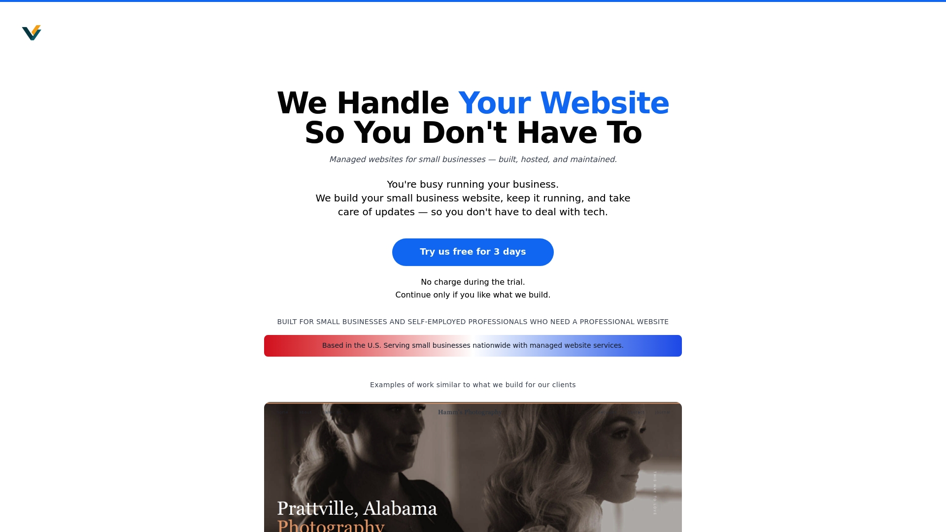
Get started today with Vegas Solutions to build a homepage that turns visitors into loyal customers without the stress. Visit us now at Vegas Solutions and take the first step toward a stronger online presence.