

More than half of your potential customers are browsing on a smartphone right now. If your website loads slowly, displays tiny text, or forces users to pinch and zoom, they leave. Fast. Over 63% of all web traffic now comes from mobile devices, and small business owners who ignore that reality are quietly losing leads every single day.
Why Mobile Friendliness Matters in 2026
Mobile devices have fundamentally changed how people find local businesses. A potential customer searching for a plumber, a hair salon, or a tax preparer is almost certainly doing it from their phone. That means your website's mobile experience is often the very first impression you make.
Key reasons mobile optimization is no longer optional:
- Local intent is high on mobile. 76% of local mobile searches result in a visit to a business within one day.
- Google ranks your mobile version first. Google uses mobile-first indexing, meaning the mobile version of your site determines your search ranking.
- Slow or broken sites cost you business. If pages take more than three seconds to load on a phone, most visitors leave without seeing what you offer.
- Your competitors may already be optimized. A cleaner, faster mobile site from a competitor is all it takes to lose a customer you could have won.
"If your site isn't mobile ready, you're invisible to half your market."
What You Need for a Mobile-Friendly Website
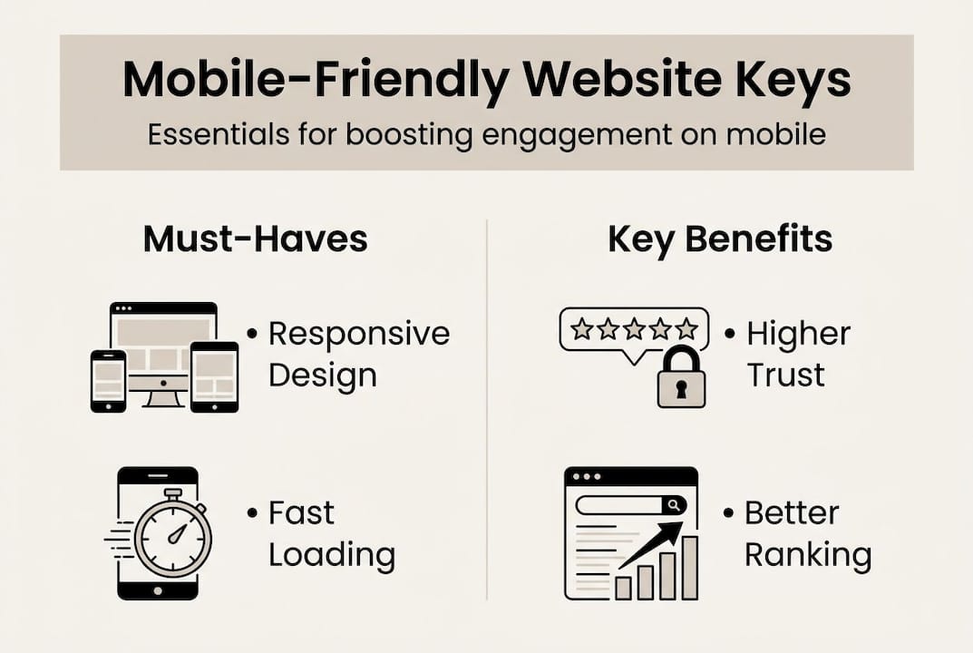
Responsive design is non-negotiable when over 63% of traffic arrives on mobile. Responsive design means your site automatically adjusts its layout to fit any screen size.
Core essentials every mobile-friendly site needs:
- A responsive template or theme that adapts automatically to different screen sizes
- Fast, reliable hosting so pages load within 2–3 seconds on a mobile connection
- Compressed images that look sharp without slowing down load times
- Touch-friendly navigation with buttons and links large enough to tap easily
- Readable font sizes that don't require zooming to read body text
- Minimal pop-ups that don't block content or frustrate mobile users
| Platform | Best For | Mobile Support | Ease of Use |
|---|---|---|---|
| WordPress | Flexible, scalable sites | Strong with right theme | Moderate |
| Wix | Beginners, simple sites | Built-in mobile editor | Easy |
| Squarespace | Design-focused businesses | Responsive by default | Easy |
| Shopify | E-commerce and product sales | Mobile optimized | Easy to moderate |
Pro Tip: Before making any changes, run your current site through Google's Mobile-Friendly Test tool. It takes less than a minute and shows exactly what's broken on mobile.
Step-by-Step: Making Your Website Mobile Friendly
- Audit your current site. Open your website on your phone and a tablet. Note anything that looks broken, too small, or hard to tap. This is your baseline.
- Choose a mobile-friendly theme. If your current theme doesn't adapt to smaller screens, switch to one that does. Most modern platforms offer responsive themes for free.
- Optimize your images. Large image files are one of the biggest causes of slow load times. Use TinyPNG or your platform's built-in compression to reduce file sizes.
- Simplify your navigation. Mobile menus should be clean and minimal. A hamburger menu works well for phones. Limit top-level menu items to five or fewer.
- Test on real devices. Don't rely only on desktop preview tools. Open your site on actual phones — both iOS and Android — to catch issues that simulators miss.
Pro Tip: Prioritize the pages that get the most traffic first. Your homepage, contact page, and top service pages will have the biggest impact on customer experience and conversions.
| Approach | Cost | Speed | Control | Support |
|---|---|---|---|---|
| DIY platform | Low | Medium | High | Self-serve |
| Hire a designer | High | Slow | Medium | Limited after launch |
| Managed solution | Predictable | Fast | Handled for you | Ongoing |
Fixing Common Mobile Website Mistakes
Knowing the pitfalls ahead of time saves you from common setbacks:
| Issue | Why It Hurts | Fix |
|---|---|---|
| Text too small to read | Visitors leave immediately | Set base font size to 16px minimum |
| Buttons too small or close together | Mis-taps frustrate users | Use 44x44px minimum touch targets |
| Images overflow screen | Looks broken, erodes trust | Add max-width: 100% to all images in CSS |
| Pop-ups blocking content | Google penalizes intrusive interstitials | Remove or delay mobile pop-ups |
| Slow load time | 53% of users leave after 3 seconds | Compress images, minimize scripts |
| No click-to-call button | Misses mobile conversion opportunity | Add a tappable phone number prominently |
Free tools to test and fix mobile issues:
- Google Mobile-Friendly Test — quick pass/fail check with specific issues listed
- Google PageSpeed Insights — performance score plus specific recommendations
- GTmetrix — detailed waterfall analysis of what's slowing your page
- BrowserStack — test your site on real device screens without owning every phone
- TinyPNG — compress images before uploading
What Most Guides Miss About Mobile-Friendly Websites
Most guides tell you to get a responsive theme and call it done. What they don't address is the ongoing work that separates a passable mobile site from one that actually converts.
A responsive theme is the starting point, not the finish line. The businesses that get the most from mobile traffic regularly audit their site on real phones, test their forms and checkout flows on mobile, watch their analytics for mobile-specific bounce rates, and update their content layout as design standards evolve.
The other overlooked factor is mobile-specific conversion elements. A desktop site might rely on a large hero section with a contact form. A mobile site needs a prominent click-to-call button, a short contact form that's easy to fill in on a phone keyboard, and a navigation menu that gets users to the right page in two taps or fewer. These aren't automatic — they require intentional design choices.
For small business owners without time to manage ongoing mobile optimization, the practical answer is a managed website service that handles it as part of ongoing maintenance — not a one-time project.
Get Expert Help With Your Mobile-Friendly Website
At Vegas Solutions, every website we build is designed mobile-first, tested on real devices, and maintained so it stays current as Google's standards evolve. If your current site isn't performing on mobile — or you've never thought about it — let's talk about what a properly optimized site could do for your business.