

Building a website that only looks polished on a desktop is like opening a store with a beautiful front entrance and a locked side door. Most of your customers will never get inside. Smartphones now account for the majority of web traffic across nearly every industry, and small business owners who ignore this reality are quietly losing leads, customers, and revenue every day. Responsive web design solves this problem by making your site readable, navigable, and conversion-ready on any screen. This guide breaks down what responsive design is, how it works, and why it matters for your business.
What Is Responsive Design?
Responsive design is not a plugin or a template setting. It's a fundamental approach to how websites are built. Responsive web design (RWD) is "an approach for designing web pages so they render well across a range of screen sizes and resolutions while maintaining usability." That means someone visiting your site on a 27-inch monitor and someone else visiting on a 5-inch phone screen both get a version of your website that looks intentional and works properly.
For small business owners, the stakes are real. Your potential customers are browsing from couches, waiting rooms, and parking lots. If your site forces them to pinch and zoom to read your phone number or find your hours, most of them will simply leave. They won't call you, they won't email you, and they probably won't come back.
Here's what responsive design actually delivers:
- Readable text on any screen without zooming or horizontal scrolling
- Touch-friendly navigation sized appropriately for fingers, not just a mouse cursor
- Images and videos that resize correctly without overflowing the screen
- Layouts that reorganize themselves to make sense on smaller widths, such as stacking columns instead of placing them side by side
- Fast load times when combined with optimized assets, because visitors aren't loading oversized elements built for desktop
"A good responsive website should feel natural on every device. Visitors shouldn't need to think about what screen they're on."
Responsiveness is not a bonus feature reserved for large companies with big budgets. It's the expected standard in 2026. Visitors assume your site will work on their phone. When it doesn't, they associate that frustration with your brand, not with the technology.
How Responsive Design Works: Key Principles and Techniques
You don't need to understand CSS code to run a business, but knowing these concepts helps you make better decisions when reviewing your website or working with a designer. A foundational approach to responsive design uses three building blocks:
1. Fluid Grids
Traditional web layouts were built in fixed pixel widths, so a column might always be exactly 600 pixels wide. A fluid grid uses percentages instead. A column that's 60% wide will naturally be wider on a large monitor and narrower on a phone, without any extra code. This keeps your layout proportional across devices.
2. Flexible Images
Images set to a maximum width of 100% will never exceed the width of their container. So a product photo on your homepage won't overflow off the screen on a small device. It simply scales down to fit. This one rule alone eliminates a huge number of visual problems on mobile.
3. CSS Media Queries
These are instructions written into your website's stylesheet that tell the browser to apply different styles when the screen reaches a certain width. For example, your site might display a three-column layout on a desktop, but media queries automatically switch it to a single column when the screen width drops below 768 pixels.

Breakpoints — the specific widths where your layout adjusts — should be based on your content, not on device brand names. A breakpoint makes sense where your content starts to look cramped or broken, not just because an iPhone has a particular width.
Pro Tip: When reviewing a new website design, ask your designer to show you the site at several screen widths, not just desktop and mobile. Look at it at medium widths too, like a small laptop or a tablet in landscape mode. If it looks awkward in between, the breakpoints may need refinement.
Responsive vs. Adaptive Design: What's the Difference?
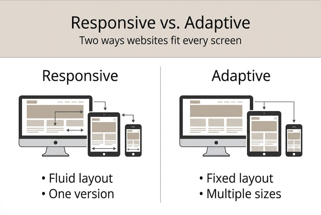
Both responsive and adaptive design aim to improve the user experience across multiple devices, but they take different paths to get there. Responsive design uses fluid adjustment to screen size, while adaptive design serves predefined layouts for specific device or size ranges.
| Feature | Responsive design | Adaptive design |
|---|---|---|
| Layout type | Single fluid layout | Multiple fixed layouts |
| How it adjusts | Continuously as screen changes | Switches between preset sizes |
| Maintenance | One codebase to manage | Multiple layouts to maintain |
| Best for | Small businesses, most websites | Large apps with complex interactions |
| Cost | Lower (one site to build) | Higher (multiple versions to build) |
| User experience | Smooth and seamless | Can feel abrupt at transition points |
For most small businesses, responsive design is the clear choice. One codebase means lower cost to build, easier updates, and no risk of one version being current while another becomes stale. Adaptive design makes sense for large enterprise apps with genuinely different user needs on different devices — a use case that rarely applies to a local service business, trade contractor, or professional services provider.
Why Responsive Design Matters for Small Business Websites
The practical impact of responsive design on small business results comes down to four areas:
1. Search Rankings
Google uses mobile-first indexing, which means the mobile version of your site is what Google evaluates when determining where you appear in search results. A site that performs poorly on mobile — even if the desktop version is excellent — will rank lower than a well-optimized responsive site. For a local business competing on terms like "plumber near me" or "landscaping company in [city]," this ranking difference translates directly into missed calls and lost jobs.
2. User Experience and Bounce Rate
Bounce rate measures how many visitors leave your site after viewing only one page. A high bounce rate often signals that visitors didn't find what they needed quickly — or couldn't navigate the site comfortably. Mobile users are more likely to leave a non-responsive site immediately. A lower bounce rate, achieved through better mobile usability, signals quality to Google and keeps more potential customers in your funnel.
3. Conversion Rate
A visitor who can easily read your services, view your photos, and tap your phone number is more likely to contact you than one who has to zoom in to read your text. Responsive design removes friction from the conversion process. The impact is measurable: businesses with mobile-optimized sites consistently report higher contact form completions and more phone calls from mobile visitors.
4. Maintenance Efficiency
A single responsive site means a single codebase. When you update your pricing, add a new service, or change your hours, you do it once. Non-responsive sites often require maintaining separate desktop and mobile versions, doubling the work and increasing the chance that one version gets left behind.
What Small Businesses Get Wrong About Responsive Design
Even business owners who have heard of responsive design often make the same avoidable mistakes:
Mistake 1: Assuming their site is already responsive. Many older websites and DIY builders claim to be "mobile-friendly" but deliver a poor experience on phones. Test your site on Google's Mobile-Friendly Test tool and look at it on an actual phone, not just resized in a browser window.
Mistake 2: Optimizing for desktop first. Sites built with desktop as the priority and mobile as an afterthought often have cramped navigation, oversized images, and text that's too small to read without zooming. The better approach is mobile-first — designing for the smallest screen and progressively enhancing for larger ones.
Mistake 3: Ignoring page speed on mobile. A responsive layout that loads large unoptimized images over a mobile data connection will still frustrate users. Responsive design and page speed optimization work together. Neither replaces the other.
Mistake 4: Not testing on real devices. Browser resize tools give you an approximation. Actual phones reveal the real experience — touch target sizes, font rendering, and load times on real networks. If you haven't tested your site on at least two different phone models, you don't have a complete picture of what your customers see.
Ready to Make Your Website Work Everywhere?
At Vegas Solutions, every website we build is fully responsive by default — designed mobile-first, tested across real devices, and maintained so it stays that way as browsers and screen sizes evolve.
If you're not sure whether your current site is costing you mobile leads, request a free website demo and see what a properly built small business website looks and performs like on any device.