

Building a research or academic website can feel overwhelming when you want to reach both experts and the general public. It is easy to lose visitors with confusing menus, slow load times, or hard-to-find content. Your website needs to work well for different users—whether they are searching for a study on their phone or browsing important updates on a laptop.
Clear navigation, mobile-ready design, and fast page speed provide a better experience and help your research get noticed. The right approach not only keeps your site visitors engaged but also improves accessibility and search visibility. If you want practical steps that will make your site easier to use and more effective, you are in the right place.
Get ready to discover proven website features that solve common problems for research and academic websites. Every item on this list is designed to help you create a site that stands out for clarity, speed, and user satisfaction.
Table of Contents
- 1. Clear And Simple Navigation For Easy Browsing
- 2. Mobile-Friendly Design For All Devices
- 3. Fast Loading Speed To Keep Visitors Engaged
- 4. Strong Security Features To Protect Your Site
- 5. Contact Information That's Easy To Find
- 6. Compelling Calls To Action That Drive Results
- 7. Reliable Website Hosting And Maintenance Support
Quick Summary
| Takeaway | Explanation |
|---|---|
| 1. Create Intuitive Navigation | A logical menu structure helps users find what they need easily, improving their experience on your website. |
| 2. Prioritize Mobile-Friendly Design | Ensure your website functions seamlessly on mobile devices to accommodate a majority of users who access sites via smartphones and tablets. |
| 3. Optimize for Fast Loading Speed | Speed is crucial; quick loading times retain visitors and boost conversion rates, impacting overall user satisfaction. |
| 4. Implement Strong Security Features | Protect your site from cyber threats by utilizing SSL encryption, strong passwords, and regular security maintenance to safeguard user data. |
| 5. Make Contact Information Accessible | Position contact details prominently to encourage communication, providing multiple channels for users to reach out effortlessly. |
1. Clear and Simple Navigation for Easy Browsing
Website navigation is the roadmap that guides visitors through your digital landscape. It serves as the critical backbone of user experience, determining whether people stay and explore or quickly click away in frustration.
A well-designed navigation system does more than just connect pages. It creates an intuitive journey that helps visitors find exactly what they need with minimal effort. Designing strong navigation enhances user experience by structuring content into logical categories that match how people actually think and search.
Key components of effective website navigation include:
- Logical menu structure that reflects user priorities
- Consistent placement of navigation elements
- Clear and descriptive labels that eliminate guesswork
- Limited number of menu items to prevent overwhelming visitors
A great navigation system makes users feel like they know exactly where they are and where they want to go.
To create a streamlined navigation experience, consider organizing your content into broad, easily understood categories. Group similar topics together and use descriptive labels that immediately tell visitors what they will find. Your goal is to make information discovery feel effortless.
User-Friendly Navigation Techniques:
- Use dropdown menus for subcategories
- Include a search bar for direct access
- Highlight the current page to provide context
- Keep navigation menus clean and uncluttered
Pro Tip: Regularly test your website navigation with real users and be willing to make adjustments based on their feedback and behavior patterns.
2. Mobile-Friendly Design for All Devices
In today's digital world mobile devices are no longer an afterthought but the primary way people access websites. With more users browsing on smartphones and tablets than ever before ensuring your website looks great and functions perfectly across all screen sizes is absolutely critical.
Mobile web browsing surpasses desktop globally, which means your website must adapt seamlessly to different devices and screen sizes. A mobile-friendly design is not just about making things smaller it is about creating a completely responsive user experience.
Key elements of effective mobile design include:
- Responsive layout that automatically adjusts to screen size
- Touch-friendly navigation with large clickable areas
- Fast loading times for mobile networks
- Simplified content that displays cleanly on smaller screens
- Readable text without requiring zooming
Mobile design is not about making a small desktop site it is about creating an entirely new user experience.
Critical Mobile Design Strategies:
- Use flexible grid layouts
- Implement responsive image techniques
- Optimize typography for mobile reading
- Minimize complex design elements
Understanding mobile design means recognizing that users interact differently on mobile devices. Buttons need to be larger touch targets need more space and content must be more concise. Your goal is creating an experience that feels natural and effortless on any device.
Pro Tip: Test your website on multiple devices and screen sizes regularly using free online responsive design checkers to ensure consistent performance.
3. Fast Loading Speed to Keep Visitors Engaged
In the digital world seconds matter. Your website's loading speed can make the difference between capturing a potential customer or watching them click away in frustration.
Site speed impacts user experience dramatically across multiple critical business metrics. Research shows that even a fraction of a second delay can significantly reduce user engagement and potentially cost you valuable conversions.
Key impacts of website loading speed include:
- Decreased bounce rates when pages load quickly
- Improved search engine rankings
- Better user experience and satisfaction
- Higher conversion potential
- Increased visitor retention
Speed is not just a technical detail it is a fundamental aspect of user experience.
Strategies for Improving Website Speed:
- Optimize image sizes
- Minimize complex scripts
- Use content delivery networks
- Enable browser caching
- Compress website files
Website performance is about creating a smooth digital experience. Visitors expect instant access to information. If your site takes more than three seconds to load you risk losing potential customers or readers who will simply move on to a faster alternative.
Pro Tip: Use free online speed testing tools to regularly monitor your website's performance and identify potential optimization opportunities.
4. Strong Security Features to Protect Your Site
In today's digital landscape your website is not just a digital storefront it is a potential target for cybercriminals seeking to exploit vulnerabilities. Protecting your online presence requires a comprehensive and proactive approach to security.
Academic data security compliance involves maintaining the confidentiality and integrity of sensitive information through strategic protective measures. Understanding and implementing robust security features is no longer optional it is essential for protecting your business and your customers.
Critical website security components include:
- SSL encryption for data protection
- Regular software updates
- Strong password policies
- Secure hosting environments
- Two-factor authentication
Website security is not a one-time task it is an ongoing commitment to protecting digital assets.
Essential Security Implementation Steps:
- Install security plugins
- Enable automatic updates
- Use complex password generators
- Implement regular backup systems
- Monitor site for suspicious activities
Your website's security strategy should create multiple layers of protection. Vulnerabilities can emerge quickly so staying informed and proactive is key to maintaining a secure online environment.
Pro Tip: Conduct quarterly security audits and consider professional penetration testing to identify and address potential weaknesses before they can be exploited.
5. Contact Information That's Easy to Find
In the digital age accessibility is currency and your website's contact information is the gateway to potential opportunities. Making your contact details simple to locate can be the difference between connecting with a valuable client or watching them move on to a competitor.
Researcher databases prioritize accessible contact information as a critical component of professional networking. Your website should serve as an open invitation for communication rather than a maze that frustrates potential connections.
Key elements of effective contact presentation include:
- Prominent placement of contact details
- Multiple contact channels
- Clear and readable formatting
- Responsive contact forms
- Professional contact page design
Your contact information should whisper welcome and shout accessibility.
Strategic Contact Information Placement:
- Include contact info in header and footer
- Create a dedicated contact page
- Use clickable email and phone links
- Add social media connection options
- Consider adding a quick contact form
Visibility is about more than just displaying information. Your goal is to make potential clients feel that reaching out is effortless and welcome. Professional communication starts with accessibility.
Pro Tip: Consider adding a quick response QR code to your contact page to make sharing your information even easier for potential clients.
6. Compelling Calls to Action That Drive Results
A call to action is more than just a button or a line of text it is the pivotal moment where website visitors decide whether to engage or move on. Crafting a powerful call to action can transform casual browsers into committed customers.
High-performing CTAs leverage neuroscience principles to guide user decisions and increase engagement. These strategic prompts are carefully designed to capture attention and motivate immediate action.
Critical elements of effective calls to action include:
- Clear and concise language
- Powerful action verbs
- Visually striking design
- Strategic placement
- Value-driven messaging
A great call to action doesn't just suggest. It compels.
Strategies for Creating Impactful CTAs:
- Use urgent and specific language
- Highlight immediate benefits
- Create visual contrast
- Keep text short and direct
- Test multiple variations
Bold and direct communication drives action. Psychological triggers matter more than generic invitations. Your goal is to make clicking feel like an irresistible opportunity rather than a chore.
Pro Tip: A/B test your calls to action by changing one element at a time to understand what truly motivates your specific audience.
7. Reliable Website Hosting and Maintenance Support
Your website is more than just a digital presence it is a critical business asset that requires professional care and continuous protection. Professional hosting and maintenance are not luxury services they are essential investments in your online success.
Professional hosting services ensure website reliability through comprehensive support that goes far beyond simple server space. These services provide a safety net that keeps your digital platform running smoothly and securely.
Key components of reliable website hosting include:
- Guaranteed uptime performance
- Regular security updates
- Automatic backup systems
- Technical support availability
- Scalable hosting solutions
Your website's reliability directly reflects your business's professionalism and commitment.
Essential Hosting Maintenance Strategies:
- Choose providers with proven track records
- Select plans with 24/7 technical support
- Verify backup and recovery protocols
- Understand service level agreements
- Monitor website performance metrics
Proactive maintenance prevents potential disasters. Small investments in hosting can save significant time and money by avoiding catastrophic website failures.
Pro Tip: Request a comprehensive service report quarterly to track your website's performance and identify potential improvement areas before they become critical issues.
Below is a concise and clear table summarizing the significant concepts and recommendations provided in the article regarding optimizing website design and functionality for enhanced user experience.
| Feature | Description | Key Implementation Steps |
|---|---|---|
| Navigation | Organize website navigation to enhance user browsing experience. | Use clear labels, logical structure, and consistent placement; test with users for improvements. |
| Mobile Design | Ensure website is responsive and user-friendly on all devices. | Use flexible grid layouts, simplify content, and create touch-friendly navigation elements. |
| Loading Speed | Minimize load times to retain user engagement and reduce bounce rates. | Optimize images, compress files, utilize CDNs, and enable caching. |
| Security | Protect the website and user data through robust security features. | Use SSL encryption, update software regularly, and implement two-factor authentication. |
| Contact Information | Make contact details accessible and user-friendly. | Display prominently on the website, offer multiple channels, and integrate clickable links for email and phone. |
| Calls to Action | Design engaging and effective calls to action for conversions. | Use strong action words, create visual contrasts, and position strategically. |
| Hosting and Maintenance | Ensure reliable hosting and continuous technical support. | Choose dependable providers, monitor site performance, and schedule regular backups. |
Simplify Your Website Success with Vegas Solutions
The article highlights challenges like managing clear navigation, ensuring mobile-friendly design, keeping your site fast and secure, and maintaining effective contact forms and strong calls to action. These are critical pain points that can overwhelm small business owners and self-employed professionals who want a strong web presence but face tech headaches and time constraints.
At Vegas Solutions we understand these struggles. We specialize in handling every website detail from design to hosting and ongoing support all in one place with clear communication. Our team ensures your website uses the best navigation practices mobile responsiveness fast loading speeds robust security and visible contact options so you never lose potential customers due to technical issues.
Experience hassle-free website management by partnering with Vegas Solutions. See how our expert care turns complex website features into reliable assets that grow your business.
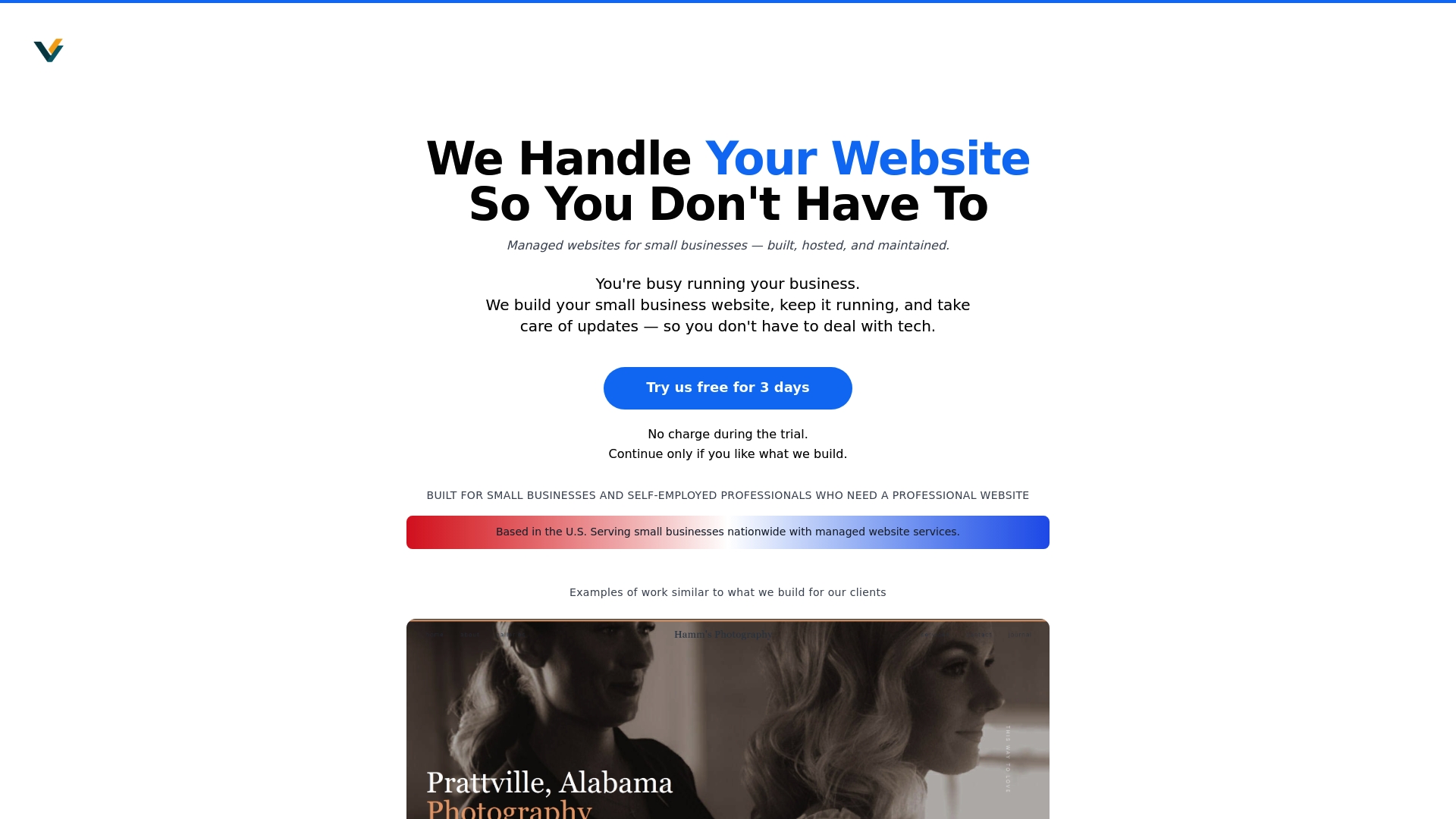
Ready to take your website checklist off your mind and into expert hands Start with a $69 demo and discover stress-free website solutions with fast turnaround and ongoing personal support. Visit Vegas Solutions now and start your journey to a fully handled professional website.
Explore more about how we build host and maintain your site Vegas Solutions and learn why so many small businesses trust us to keep their digital storefronts running smoothly.