

Choosing the right responsive website design can feel overwhelming when you’re running a small business. You need a site that looks professional on every device, loads quickly, and converts visitors into customers without breaking your budget. This article walks you through proven evaluation criteria, showcases five real-world responsive design examples that work for small businesses, and provides a practical comparison framework to help you make the best choice for your unique needs.
How to evaluate responsive design for your small business
Before you fall in love with a particular design aesthetic, you need a systematic way to assess whether it will actually serve your business goals. Effective responsive designs must prioritize usability, loading speed, and adaptability across devices to keep visitors engaged and moving toward conversion.
Start with these five essential criteria. First, usability means your navigation works intuitively on touchscreens and traditional mice alike. Customers should find what they need in three clicks or less, regardless of their device. Second, speed matters tremendously because visitors abandon sites that take longer than three seconds to load. Third, mobile adaptability ensures your layout adjusts smoothly from smartphones to tablets to desktops without awkward horizontal scrolling or tiny text.
Visual consistency ranks fourth on your checklist. Your brand colors, fonts, and imagery should maintain their impact whether someone views your site on a phone during their commute or a desktop at their office. Finally, conversion focus means every design element guides visitors toward your desired action, whether that’s scheduling a consultation, making a purchase, or requesting a quote.
Here’s a practical evaluation process you can use:
- Test the design on at least three different devices, including a smartphone, tablet, and desktop computer.
- Check loading speed using free tools and aim for under two seconds on mobile networks.
- Navigate through the site as if you’re a customer trying to complete your most common business transaction.
- Verify that contact forms, buttons, and menus work smoothly with both touch and click interactions.
- Review analytics data if available to see how visitors actually interact with similar designs.
Pro Tip: Watch how real users interact with your top three design candidates by asking friends or customers to complete a specific task on each site. Their hesitations and questions reveal usability issues you might miss when you’re too familiar with the content.
The evaluation framework gives you confidence that you’re choosing substance over style. A gorgeous design that frustrates mobile users or loads slowly will cost you customers, while a well-optimized responsive design turns visitors into loyal clients.
Top 5 responsive design examples for small businesses in 2026
Seeing responsive design in action helps you understand what works for businesses similar to yours. These five examples represent different industries and demonstrate how thoughtful design choices create excellent experiences across all devices.
Example one features a local service provider using a clean, card-based layout. The homepage displays services as tappable cards that expand to show details, making it easy for mobile users to browse offerings with their thumbs. Showcased websites demonstrate optimized layouts and features that improve visitor retention and conversions for small business sectors. Key features include:
- Large, touch-friendly buttons for booking appointments
- Simplified navigation that collapses into a hamburger menu on mobile
- Optimized images that load progressively to maintain fast page speeds
- Click-to-call phone numbers prominently displayed on mobile views
Example two shows an e-commerce site for handmade products with a flexible grid system. Product photos automatically adjust from four columns on desktop to two on tablets and one on phones, ensuring images stay large enough to showcase details. The checkout process condenses to essential fields on mobile while maintaining all functionality.

Example three highlights a professional services firm with a content-rich site. Long-form articles remain readable on small screens through generous line spacing, appropriate font sizes, and strategic use of subheadings. The sidebar content stacks below the main article on mobile instead of creating a cramped two-column layout.
Example four demonstrates a restaurant site prioritizing visual impact. Full-width hero images resize intelligently, and the menu transforms from a multi-column layout to an accordion-style interface on phones. Online ordering integrates seamlessly regardless of device, with a persistent cart icon that follows users as they browse.
Example five represents a fitness studio with scheduling at its core. The class calendar switches from a week view on desktop to a day view on mobile, making it simple to see available times without excessive scrolling. Member login and account management work identically across devices, reducing friction for customers booking on the go.
Comparing responsive design options: pros and cons table
A direct comparison helps you weigh trade-offs between different responsive approaches. This table evaluates the five examples against criteria that matter most to small business owners.
| Design Example | Pros | Cons |
| — | — |
| Card-based service site | Extremely intuitive for mobile users, fast loading, easy content updates | Limited visual customization, may feel generic without strong branding |
| Grid e-commerce layout | Showcases products beautifully, scales perfectly across devices, familiar shopping experience | Requires quality product photography, can be slow with large inventories |
| Content-rich professional site | Excellent for SEO, establishes authority, highly readable on all screens | Text-heavy pages may overwhelm some visitors, requires consistent content creation |
| Visual restaurant site | Stunning first impression, appetite appeal through imagery, streamlined ordering | Image-dependent design needs professional photos, larger file sizes require optimization |
| Scheduling fitness site | Conversion-optimized for bookings, reduces administrative work, member-friendly | Complex functionality may increase development costs, requires ongoing calendar management |
The comparison reveals that no single design approach wins every category. Your choice depends on which pros align with your business model and which cons you can manage effectively. Comparative analysis helps identify which responsive design features align best with business priorities like speed, aesthetics, or functionality.
Pro Tip: Prioritize designs that balance visual appeal with loading speed by using modern image formats like WebP and implementing lazy loading for below-the-fold content. A beautiful site that loads slowly will always underperform a fast site with good design.
Consider your technical resources when evaluating options. The card-based and grid layouts typically require less ongoing maintenance, while content-rich and scheduling-focused sites need regular attention to stay current and functional. Budget for both initial development and long-term management when making your selection.
Choosing the right responsive design for your business needs
Matching design features to your specific situation ensures you invest in a website that actually serves your business goals. Tailoring design choice to business type and customer behavior maximizes online engagement and conversion potential.
Start by analyzing your industry requirements. Service businesses benefit most from designs that make contact and booking effortless, with prominent calls to action and simplified forms. Retail businesses need product showcases with smooth checkout flows. Professional services require credibility builders like case studies, testimonials, and detailed service explanations.
Your target audience’s device preferences matter significantly. Check your current analytics if you have a website, or research industry benchmarks to understand whether your customers primarily browse on mobile or desktop. A business targeting busy professionals might see 70% mobile traffic, while B2B services might have more desktop users researching during work hours.
Consider these practical factors when making your final decision:
- Content volume: Sites with extensive information need robust navigation and search functionality
- Update frequency: Choose designs that make it easy to add new content if you publish regularly
- Transaction complexity: Simple purchases or bookings work with streamlined designs, while complex services need more explanation space
- Growth plans: Select designs that can accommodate new product lines, services, or locations without complete redesigns
Test your top candidates thoroughly before committing. View each design on your own phone, tablet, and computer. Ask colleagues or customers to complete your most important conversion action on each option. Time how long it takes to load on both WiFi and cellular connections.
Your business goals should drive the final decision. If lead generation matters most, prioritize designs with prominent contact forms and clear value propositions. For e-commerce, focus on smooth product browsing and checkout experiences. Brand awareness benefits from visually distinctive designs that showcase your unique personality.
Remember that responsive design is not a one-time decision. Plan to refresh your design every two to three years as technology evolves and user expectations change. Choose a design system that allows incremental improvements rather than requiring complete overhauls when you want to update specific features.
Get expert responsive website design support
Implementing the right responsive design requires both technical expertise and strategic thinking about your business goals. Vegas Solutions specializes in creating responsive websites optimized specifically for small businesses and self-employed professionals who need sites that work flawlessly across all devices.
We handle everything from initial design through hosting and ongoing maintenance, giving you a single point of contact instead of coordinating between multiple vendors. Our team understands the evaluation criteria, design options, and business considerations covered in this article because we apply them daily for clients across diverse industries.
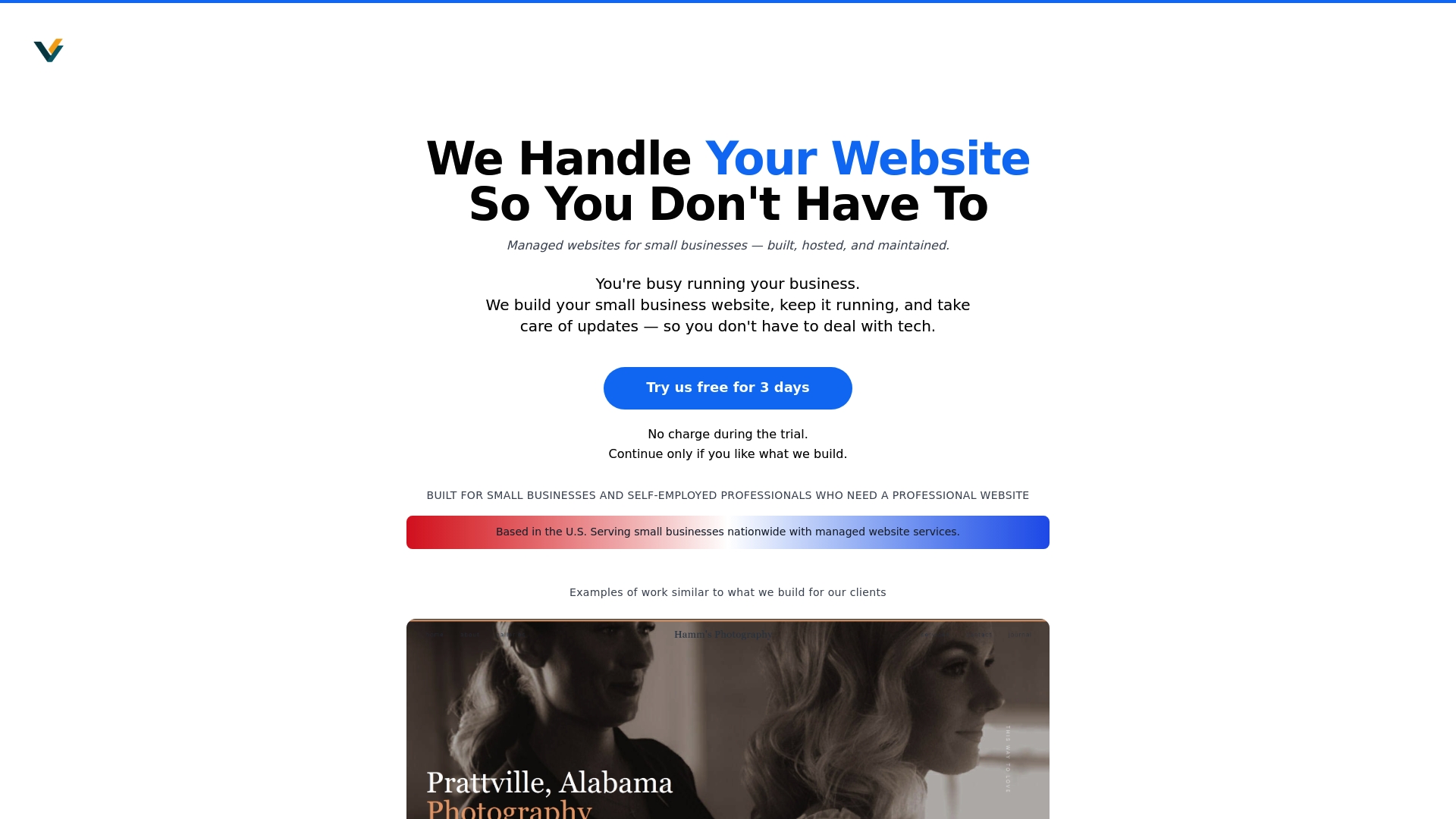
Explore our transparent pricing options to find a plan that fits your budget, or check out our Montgomery AL website design services if you’re looking for local expertise. Visit our main site to see how we turn responsive design principles into websites that drive real business results.